

How to Choose the Perfect F1 Vintage Poster
More than just something to hang on the wall, a Formula 1 vintage poster is a time capsule. It’s a snapshot of motorsport history, capturing the raw energy of legendary drivers, iconic circuits, and the groundbreaking cars they piloted. Each print is this perfect blend of artistic flair and historical weight, making it a timeless conversation starter for any true enthusiast.
Why F1 Vintage Posters Capture Motorsport History
An F1 vintage poster is more than just paper and ink; it’s a time machine. It freezes a single, powerful moment from one of the sport's golden eras, letting you connect with the visceral thrill of racing long before modern aerodynamics and complex hybrid engines came into play. These aren't just decorations; they are windows into the very soul of motorsport.
They tell incredible stories of drivers pushing machines to their absolute limits, from the raw power of the 1970s to the huge technological leaps of the 1980s. A single image can bring back the roar of an engine, the smell of burning rubber, and the nail-biting tension of a championship fight. It’s this deep emotional connection that separates a simple picture from a treasured piece of art.
Bringing the Racetrack Home
Placing an F1 vintage poster in your home or office does more than just fill a space. It injects a real sense of energy and passion into the room, turning a plain wall into a focal point that says everything about your love for the sport. It’s your way of celebrating the heroes and machines that defined generations of racing.
Each design is a powerful reminder of what makes Formula 1 so captivating:
- Legendary Drivers: Immortalising titans like Senna, Schumacher, and Lauda right at the peak of their powers.
- Iconic Circuits: Capturing the unique character and challenge of historic tracks like Monaco, Monza, or Silverstone.
- Groundbreaking Cars: Showcasing the beautiful, and often dangerous, designs that pushed engineering to new heights.
For any enthusiast, a vintage poster is a tribute to the heritage of the sport. It’s a celebration of the artistry, the danger, and the relentless pursuit of speed that defines Formula 1’s enduring appeal. Understanding this rich backstory is key, and you can explore more of the sport's incredible journey by diving into this comprehensive F1 history.
Here at TrackNation, we honour this legacy through our own curated collection. Our premium canvas prints and minimalist frames are designed to preserve these iconic moments, making timeless motorsport art accessible to both new fans and seasoned collectors. We believe every great racing story deserves to be told, and our art helps you tell it.
A Journey Through the Eras of F1 Poster Design
Every F1 vintage poster is more than just paper and ink; it’s a time capsule. It captures the artistic soul of its time, telling a story that runs parallel to the evolution of the sport itself. Learning to read this visual language helps you pinpoint the exact style that gets your own engine running.
The story starts in the 1950s and 60s, an era defined by a bold, almost brutalist simplicity. Early posters were often typographic masterpieces, relying on nothing more than powerful fonts and minimalist layouts to grab your attention. Think clean lines, striking block colours, and only the essential details: the date, the circuit, and maybe a stylised blur of a car. This was the age of letterpress printing, where design was shaped by the physical limits of metal type, resulting in a look that feels incredibly elegant and impactful today.
The Photographic Revolution of the 70s
As offset printing became the norm in the 1970s, the visual language of F1 posters took a sharp turn. Suddenly, designers had the freedom to use high-quality photography, bringing the raw, unfiltered action of the track right into people's hands. This decade gave us those incredible, dynamic shots of cars sliding sideways through corners, drivers locked in intense focus, and the gritty, oil-stained atmosphere of the pitlane.
The focus shifted from artistic interpretation to visceral reality. It was a golden age for motorsport art, immortalising the raw energy of legends like Niki Lauda and James Hunt in print. This change perfectly mirrored F1’s own rise to global fame as the sport became faster, more dangerous, and undeniably more thrilling to watch.
This timeline breaks down the key shifts in F1 poster art, connecting what was happening in history with the dominant artistic styles of the day.
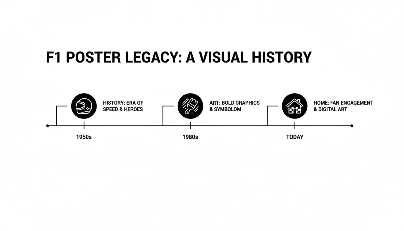 You can clearly see how the technology available in each decade directly shaped the art, moving from simple graphics to the photo-rich designs we know and love.
The Rise of Sponsorship and Brand Identity
The 1980s and 90s are when Formula 1 truly became a commercial powerhouse, and the posters went right along for the ride. Sponsor logos weren’t just slapped on; they became central design elements. The iconic red and white of McLaren-Honda or the vibrant yellow of Camel-Lotus came to define the entire visual landscape. Graphic design got bolder and more experimental, with electric colours and geometric shapes reflecting the slick, high-tech evolution of the cars themselves.
This is the era that hits the nostalgic sweet spot for so many of us. The art perfectly captures the larger-than-life rivalries of drivers like Ayrton Senna and Alain Prost. For many fans, browsing our collection of retro track prints is like taking a trip back to witness those incredible moments firsthand.
A great F1 vintage poster does more than just show a car; it captures the very essence of an era. Whether it's the raw simplicity of the 50s or the commercial gloss of the 90s, the design should transport you right back to that moment on the grid.
Australian Grand Prix and a Bit of Local Flavour
For Aussie fans, the Grand Prix landing in Melbourne added a brilliant local chapter to this visual history. The first Australian Grand Prix roared into Albert Park in 1996, pulling in a staggering 401,000 attendees over four days—a record that still stands today. That massive turnout didn't just cement Australia's spot on the F1 calendar; it kicked off a new wave of locally inspired motorsport art, creating posters that hold a special meaning for fans down under.
Understanding this journey—from simple typography to photographic action and branded art—helps you see the story behind each print. It lets you choose a poster that not only looks fantastic on your wall but also truly connects with the specific chapter of motorsport history you love the most.
What Separates a Good Print from a Great One
When you're hunting for that perfect F1 vintage poster, it’s easy to get swept up in the design itself. The roaring engine, the iconic livery, the legendary driver—that's the soul of the piece. But what makes it last, what makes it feel like true art on your wall, comes down to the details under the hood.
Understanding what makes a print truly great is the difference between buying a disposable poster and investing in a piece of motorsport history that will look incredible for years to come.
It all starts with the digital file. Think of it like a photograph—if you take a grainy, low-quality picture and blow it up, it becomes a blurry mess. The same thing happens with prints. To get those sharp, crisp lines that make a design pop, you need a source file with a high density of pixels, measured in DPI (dots per inch).
A stunning design pulled from a quick Google search might look fine on your phone, but it will turn into a pixelated disaster on a large canvas. A great print always, always begins with a high-resolution file, typically 300 DPI or higher. This is non-negotiable for capturing every subtle detail just as the artist intended.
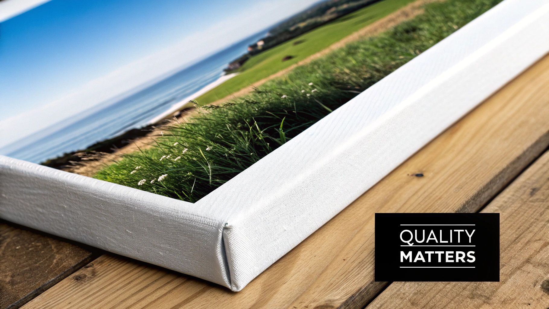
The Foundation: It’s All About the Material
With a sharp image ready to go, the next question is: what are you printing it on? This is where the gap between a standard poster and a premium piece of wall art becomes glaringly obvious. Most cheap posters are printed on thin, glossy paper that creases at the slightest touch and fades if it even sees a sunny day.
For something with real substance and a luxurious feel, you need a heavier, more tactile material. At TrackNation, we print exclusively on premium cotton canvas. This isn't just fancy paper; it’s a woven fabric that gives the artwork a completely different character.
- Tough as Nails: Canvas is far more durable than paper. It won’t tear easily and handles the stretching and framing process like a champ.
- A Touch of Class: The subtle texture of the weave adds a tangible depth that makes the print feel like it belongs in a gallery, not a dorm room.
- Colours That Pop: The material absorbs ink beautifully, which means you get deeper, richer blacks and more vibrant colours that leap off the wall.
This physical quality turns a simple F1 poster into a permanent fixture. It has a weight and presence that paper just can't replicate. You can see and feel the difference for yourself across our entire collection of premium track prints.
The Finishing Touch: Ink That Lasts a Lifetime
The final piece of the quality puzzle is the ink. We’ve all seen it: an old poster in a shop window, its brilliant reds faded to a sad, washed-out orange. That’s what happens when standard inks meet UV light—and here in sunny Australia, that’s a battle the ink will always lose.
To prevent this tragedy, premium prints use what are known as archival inks. These are pigment-based inks specially designed to resist fading and stand the test of time.
Think of it this way: standard ink is like watercolour paint—beautiful but delicate, and highly susceptible to light and moisture. Archival ink is like oil paint—it’s made to endure for generations.
This ensures the colours in your artwork stay true and punchy for decades, not just a few years.
To make it even clearer, here’s a quick checklist to help you spot a quality print.
Poster Quality Checklist
| Quality Factor | Standard Poster | TrackNation Premium Print |
|---|---|---|
| Resolution | Low DPI, often blurry when enlarged | 300+ DPI for razor-sharp detail |
| Material | Thin, flimsy paper that easily creases or tears | Thick, durable 100% cotton canvas |
| Texture | Flat, glossy, and prone to glare | Subtle, artistic weave with a matte finish |
| Ink | Standard dye-based inks that fade quickly | Archival-grade inks for fade resistance |
| Longevity | Fades and degrades within a few years | Designed to last for decades without losing colour |
By choosing a print made with a high-resolution file, premium cotton canvas, and archival inks, you’re not just buying a poster. You’re investing in a lasting piece of art that honours the history of motorsport with the quality it deserves. It’s this powerful combination that truly separates the good from the great.
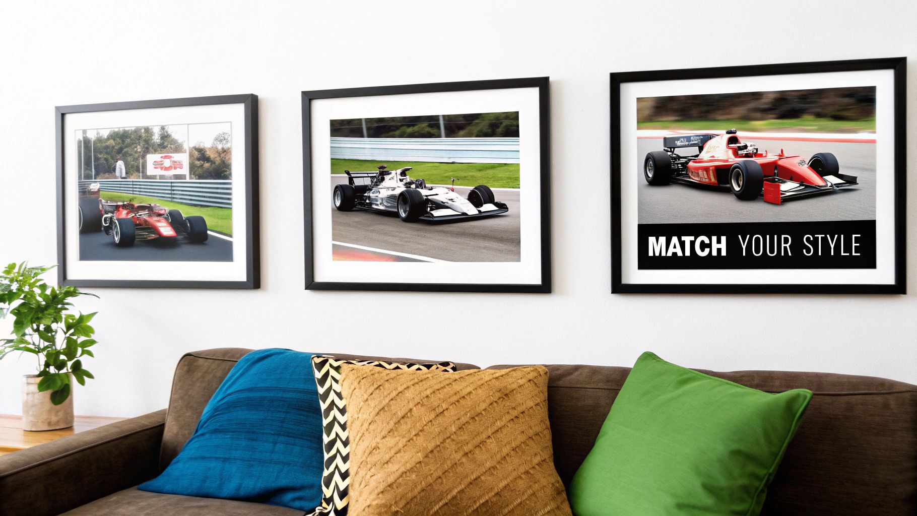
Matching Your Poster to Your Personal Style
Choosing the perfect F1 vintage poster is just the start of the journey. The real magic happens when you make it yours, selecting the right material, frame, and finish to turn a simple print into a gallery-worthy centrepiece. This is where your passion for motorsport truly integrates with your home's decor.
Think of it like this: the print is the engine, but the frame is the chassis. One brings the power and the story, but the other gives it form and connects it to the world around it. It’s your chance to personalise the piece so it doesn’t just hang on the wall, but feels like it truly belongs there.
The goal is to strike a balance between the poster's aesthetic and your room's vibe, creating a cohesive look that feels both intentional and effortlessly cool.
The Great Frame Debate: Unframed vs. Framed
The first call you’ll need to make is whether to frame your art at all. An unframed canvas has a raw, minimalist appeal, but a frame adds structure, protection, and a polished finish that pulls the eye right where you want it—on the artwork.
Let’s break down the options:
- Unframed Canvas: This gives you a modern, gallery-wrap look where the image spills over the edges. It’s a fantastic choice for a clean, contemporary space where you want the art to do all the talking.
- Standard Framed Print: The classic choice. A frame provides a traditional border that neatly contains the artwork, helping it stand out against a busy or colourful wall.
- Premium Framed Canvas: This is the best of both worlds. You get the rich texture and durability of canvas, elevated by the refined finish of a high-quality frame. It creates a substantial piece with a truly premium feel.
A well-chosen frame doesn't just surround the art; it completes it. It’s the visual bridge connecting the colours and mood of the F1 vintage poster to the furniture, textures, and overall style of your room.
For a bit of inspiration, check out how different framing styles can transform a piece by exploring our collection of Formula One wall art.
Finding the Perfect Finish for Your Space
Once you've opted for a frame, the next step is picking a finish that sings in harmony with your interior design. The frame's colour and material can dramatically alter the poster's final look, either making a bold statement or blending in seamlessly.
Here’s a look at some popular finishes and how they might fit in your home:
- Minimalist Black: Timeless and versatile, a black frame creates a strong, clean border that makes colours pop. It’s perfect for modern, industrial, or monochrome interiors and works beautifully with just about any F1 poster.
- Clean White: For a fresh, bright, and airy feel, you can’t go wrong with a white frame. It’s ideal for Scandi-inspired or coastal-themed rooms and helps lighter-coloured posters feel even more open on the wall.
- Natural Wood: To add a touch of warmth and texture, a natural wood frame is unbeatable. It pairs wonderfully with mid-century modern, rustic, or bohemian decor, adding an organic element that makes a room feel more inviting.
Tips for Creating a Cohesive Look
Matching your frame to your room is about more than just colour—it's about creating visual harmony. Start by looking at the dominant colours in the F1 poster itself. Does it feature the brilliant red of a classic Ferrari or the deep blue of a Williams? You can echo one of these accent colours in your cushions or a throw rug to tie the whole room together.
Next, take a look at the existing finishes in your space. If you have black metal light fixtures, a black frame will create a fantastic sense of continuity. Likewise, if your room features oak furniture or timber floors, a natural wood frame will complement those elements perfectly.
Ultimately, you want to choose a combination that feels authentic to you. By carefully thinking through the material, frame, and finish, you can create a personalised piece of motorsport art that looks like it was made just for your home.
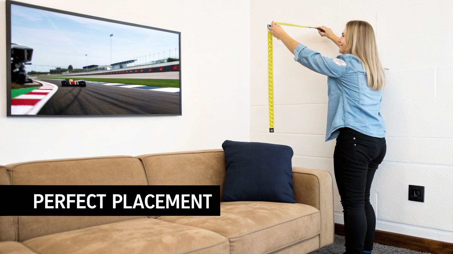
You've found the perfect vintage F1 poster. That's the easy part. Now, where do you hang it? The placement is just as crucial as the piece itself, transforming a simple print into a powerful statement. Get the size and positioning right, and your artwork won’t just decorate a room—it will define it.
Think of your wall as a racetrack. You wouldn't just stick a chicane in the middle of a long straight; every element needs to be positioned for maximum impact. It’s the same principle here. The right poster in the wrong spot can feel lost and awkward, but a thoughtfully placed piece commands attention and ties the entire room together.
First things first: what role do you want this artwork to play? Are you after a single, massive print to act as a dramatic focal point? Or maybe a curated collection of smaller prints to create a dynamic gallery wall? Each approach has a different feel and requires a unique strategy.
Choosing the Right Scale for Your Space
In interior design, scale is everything. A poster that's too small for a huge wall will look like an afterthought. One that's too big will completely overwhelm a space and make it feel cramped. The trick is finding that perfect balance with the furniture and the dimensions of the wall itself.
A great rule of thumb is the two-thirds rule. When you're hanging art above furniture—like a sofa or a headboard—the piece should be roughly two-thirds the width of the furniture below it. This creates a really pleasing visual anchor, making the art and furniture feel connected.
For a standalone piece on a blank wall, my advice is to go bigger than you think. A large F1 vintage poster can make a room feel more expansive and even a bit more luxurious. Don’t be afraid to let a stunning print of a classic circuit or a legendary driver dominate the space. It’s a guaranteed conversation starter. Our collection of racetrack framed prints has a bunch of different sizes to help you find that perfect statement piece.
Mastering the Art of Placement
Once you've got the size sorted, placement is your next mission. The most common mistake people make? Hanging their art way too high. You want the centre of your artwork to be at eye level, which for most people is around 145-155 cm from the floor. This creates an immediate, comfortable connection for anyone looking at it.
Pro Tip: If you're creating a gallery wall with a group of posters, treat the entire collection as a single, unified piece. Map it all out on the floor first until you find a layout you love, then hang them so the centre of the whole grouping is at that sweet spot—eye level.
Need some ideas to get you started?
- The Living Room Centrepiece: Hang a large, panoramic print of a circuit like Monaco or Spa right above your sofa.
- The Hallway Gallery: Got a narrow hallway? Arrange a series of smaller, vertically-aligned driver portraits to create a sense of motion and history.
- The Office Motivator: Place a poster of your favourite team or car directly in your line of sight from your desk for a bit of daily inspiration.
Here in Australia, the vintage F1 poster scene has a deep connection to the legacy of Albert Park. Digital art celebrating the circuit’s iconic 5.278 km layout is huge right now, with sellers offering instant-download files in standard aspect ratios like 2:3, perfect for printing up to 61x91 cm. To make sure these prints can handle the humid Aussie climate, experts recommend using 200-300gsm archival matte paper for its vibrant, fade-proof qualities.
Right then, you're on the final lap. You've browsed the collection, a few designs have caught your eye, and you're ready to bring a piece of racing history home. But before you head to the checkout, let's run a quick pre-race check.
Think of this as your final pit stop strategy session. Getting these last few details right ensures the F1 vintage poster you choose isn't just something you like, but something you'll love for years to come. It’s about making sure the art tells your story as a fan.
The Heart of the Matter: The Design
First things first, does the art speak to you? The best pieces are the ones that make you feel something—a jolt of nostalgia for a race you'll never forget or a surge of pride for your favourite driver. It has to connect with you on a personal level.
Before you make the final call, ask yourself these quick questions:
- Is this my driver or team? A poster should be a tribute to the heroes you root for, whether it's a modern-day legend or a giant from a golden era.
- Does the style capture the era I love? From the simple, bold typography of the 1950s to the vibrant, high-octane photography of the '80s, make sure the aesthetic gets your engine running.
- Does the design celebrate an iconic circuit? Choosing a print of a beloved track like Albert Park or Monaco is a brilliant way to immortalise a piece of F1's sacred ground.
The most powerful F1 vintage poster is one that tells a story you want to hear every day. It’s a visual reminder of the speed, drama, and history that makes this sport so captivating.
Nailing the Technical Details
Once you've found a design that hits you right in the heart, it's time to switch gears and think like an engineer. The practical details—material, frame, and size—are what elevate a simple print into a stunning, gallery-quality centrepiece. Spending a moment on these now will pay off for decades.
Double-check these crucial specs:
- Material and Frame: Have you picked the right combo for your space? Think about how a premium canvas print with a minimalist black, white, or natural wood frame will tie in with your existing decor.
- Sizing and Placement: Is the size right for the wall you have in mind? Don't forget the two-thirds rule for hanging art above furniture. You'll want to position the centre of the piece at eye level for maximum impact.
- Seller Reputation: Are you buying from a trusted source known for quality? At TrackNation, we're obsessed with the details, using high-resolution source files, archival inks, and premium cotton canvas to guarantee a durable, vibrant piece of art.
Running through this checklist means you've covered every angle. You’re not just buying an F1 vintage poster; you're investing in a curated piece of motorsport art, chosen with the care and precision of a world-class pit crew.
A Few Common Questions
Diving into the world of motorsport art can sometimes bring up a few questions. To help you choose the perfect piece for your space, we've put together some clear, straightforward answers to the things F1 fans and art lovers ask us most.
What’s the Difference Between Vintage and Retro-Style Posters?
This is a great question, and the distinction is pretty important. A true F1 vintage poster is an original print from a specific time in history. Think of it as a genuine artefact – it carries the authentic wear and tear of its era, which is why they’re often rare, fragile, and carry a hefty price tag.
On the other hand, a ‘retro-style’ poster is what we specialise in here at TrackNation. We create modern prints that capture the unique look and feel of those past eras. It’s really the best of both worlds. You get to enjoy those classic, iconic designs on high-quality, durable materials like cotton canvas, making them perfect for today’s homes without the cost and fragility of an original.
How Do I Choose an F1 Poster as a Gift?
The best gifts always come from the heart. The trick is to think about what makes them tick as a fan. Who’s their favourite driver or team? Is there a particular race they bring up all the time? Maybe they’re obsessed with a specific era, like the Senna years, Schumacher's reign, or the wild rivalries of the 1970s.
A poster of a beloved circuit is almost always a winner, too – think Albert Park for an Aussie fan or Monza for a die-hard Tifosi.
To really nail it, have a think about their home décor. Choosing a frame finish that complements their style—whether it’s minimalist black, clean white, or a natural wood grain—shows you’ve put in that extra bit of thought. It ensures the gift not only looks fantastic but feels like it was made just for them.
That personal touch is what turns a great gift into an unforgettable one.
How Should I Look After My Canvas F1 Poster?
Keeping your premium canvas print looking amazing is refreshingly simple, so it can stay a stunning centrepiece for years to come.
The single most important thing is to avoid hanging it in direct, constant sunlight. While we use archival inks specifically for their fade-resistant qualities—a must-have for our sunny Australian climate—this simple step is the best way to prevent any colour fading over the long run.
When it comes to cleaning, just follow these simple steps:
- Gently dust the canvas and frame every now and then with a soft, dry cloth.
- Steer clear of water or any cleaning sprays on the canvas itself.
- Never use anything abrasive that could scratch the print or the frame.
With just that little bit of care, your F1 vintage poster will keep bringing the thrill of the track into your home, looking as vibrant as the day you first unboxed it.
Ready to find the perfect piece of motorsport history for your walls? Explore the full collection at TrackNation and discover premium F1 wall art designed by fans, for fans. https://tracknation.au